That Time an AI Built Me a Synthesizer, or How to Find the Wow Factor
I asked Claude for an award-winning website and got a synth I could actually play. Here is what made it good, how to brainstorm the same thing for an existing page, and a skill you can download.
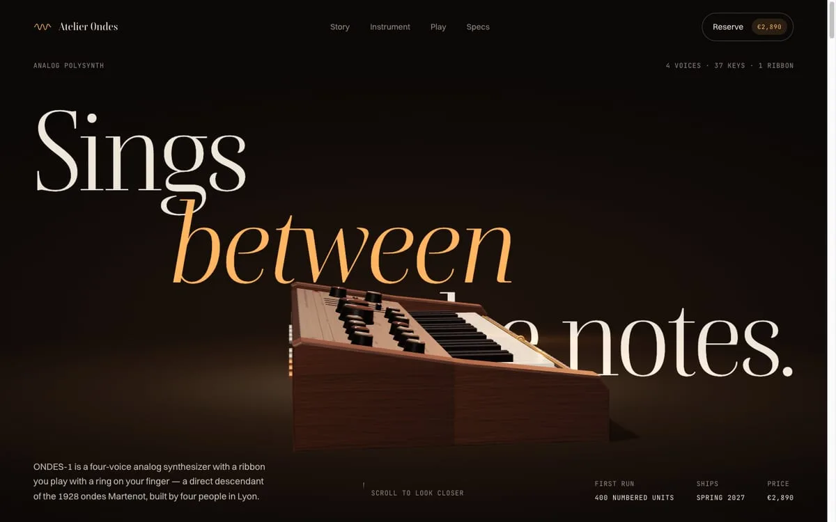
I wanted to see what’s possible. That was the whole prompt, more or less: pick a topic, write a brief, run three agents, and each of them builds a modern “award winning” site. Personal blog, product page, whatever.
Claude picked a synthesizer. A fictional one. The ONDES-1, a four-voice analog polysynth from a four-person studio in Lyon, with walnut cheeks, 37 keys and a ribbon you play with a ring on your finger. €2,890, 400 units, ships spring 2027. None of it exists.
Twenty-something minutes later I opened the first site, pressed A on my keyboard, and it played a note. I pressed S, D, F and played a very bad melody, and a line through the giant logo wobbled along with the sound. I sat there smiling at a fake product page like an idiot.
This post is about why that worked, because it wasn’t luck.
Three agents, one brief, three completely different sites
Every agent got the same brief: the product facts, a list of required sections, and one hard requirement — a playable synth in the page, using Web Audio, that only starts after the visitor clicks something. Static HTML, CSS and JS. No build step, no external images, no lorem ipsum, no console errors.
What made them different was a short art direction for each one:
- Swiss Signal — “Experimental Jetset meets a Braun manual”. Huge condensed type, a visible grid, black on off-white, and one blue.
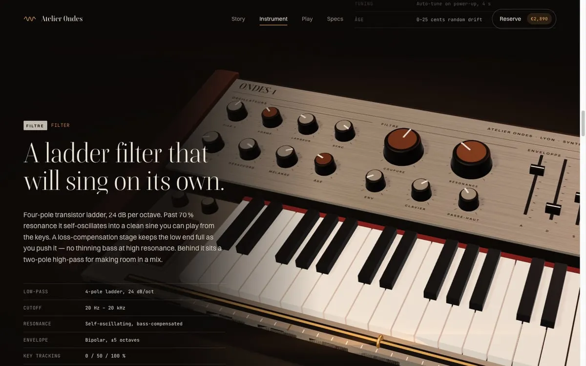
- Nocturne — “an Apple product launch crossed with a late-night recording studio”. A 3D synth built in Three.js, warm light, the camera flying to each feature as you scroll.
- Hi-Fi Catalogue, 1974 — a 70s Japanese hi-fi brochure. Cream paper, mustard and walnut, knobs you drag to turn.
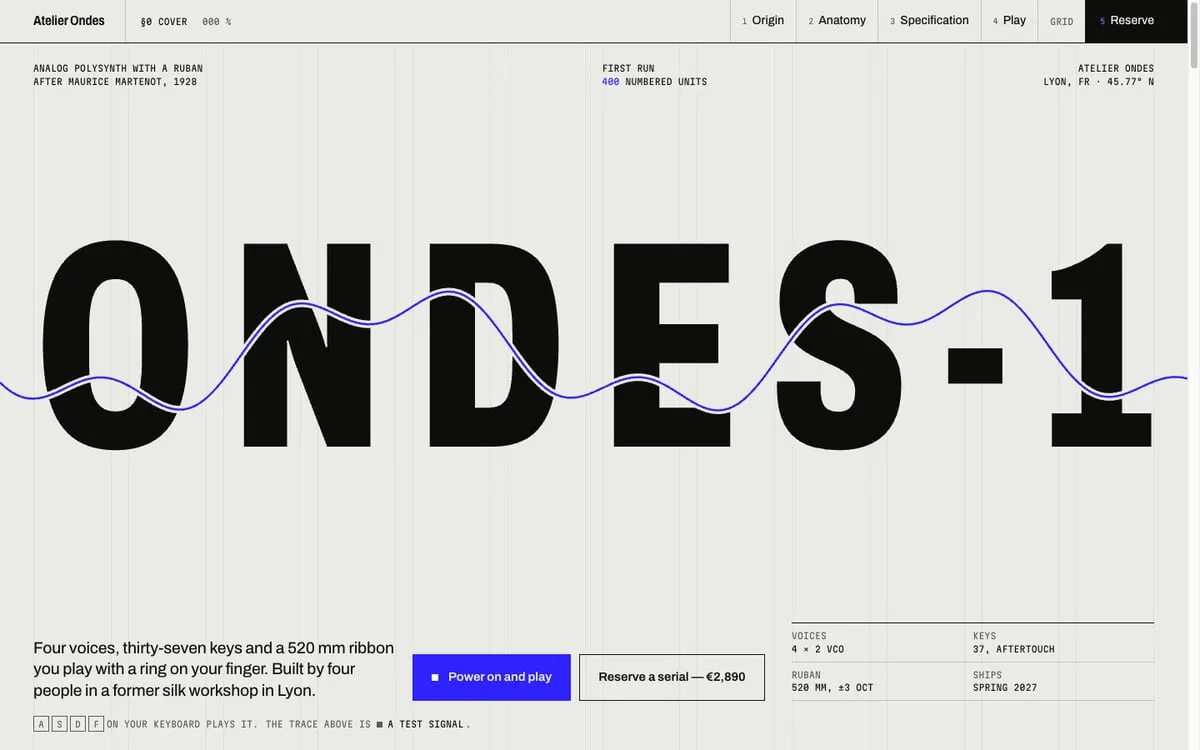
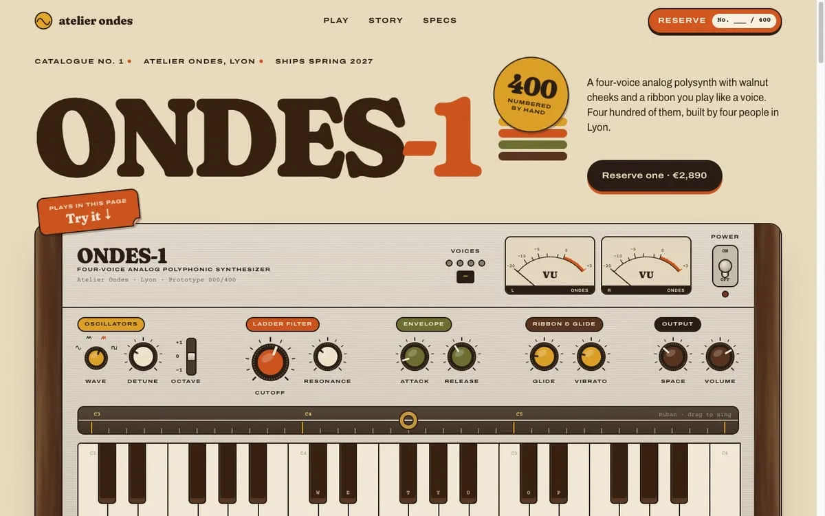
Same product, same brief, and the three sites share nothing visually. In the Swiss one the oscilloscope is drawn from the actual sound you make. In Nocturne you click the 3D keys and they go down. In the catalogue one you flip the power switch, it plays a little four-note chime, and the VU needles swing.
Don’t take my word for it, they’re live. Turn the sound on, open one, and press A to K: Swiss Signal · Nocturne · Hi-Fi Catalogue. They’re exactly what the agents built, untouched. The product, the price and the pre-order form are all fake, so please don’t try to buy one.
So what actually made it good?
I asked, obviously. Is it the prompt? The stack? The visual direction? The honest answer is all of them, in roughly this order:
- A separate art direction per agent. Without it, all three would have drifted to the same dark gradient with Inter on top. Named references (“Braun manual”), a rule for type, a rule for colour, a rule for motion (“crisp, mechanical, no floaty blobs”) — that’s what makes them diverge.
- A wow that comes from the subject. A synth is something you play. The interaction isn’t decoration on top of the product page, it is the product.
- A specific brief. Real numbers, a place, a price. Vague input gets you vague copy.
- A boring stack. No framework, no build, no config to fail. All the effort goes into the thing you see.
- Time to check their own work. Each agent ran for 20–30 minutes, took screenshots of its own site at different screen sizes, and fixed what looked off.
The second one is the one that stuck with me. I kept thinking about it the next day, and I think it’s the whole trick:
Don’t ask “what cool effect can I add?”. Ask “what does this thing do, and how can the visitor do it too?”
A parallax effect on a synth page is a parallax effect. A synth you can play on a synth page is a reason to stay.
AI got really, really good at animations
Not long ago, asking an AI for “an animation” got you a fade-in and a button that bounces like it had too much coffee. This time I got rope physics.
Not exaggerating. When I later tried the same thing on my own site, one agent built cables that sag and swing as you drag them, using verlet integration (a cheap way to simulate a rope as a chain of points). Another built a sourdough jar with bubbles that form, rise and pop, and stop animating when you scroll it off screen so your laptop fan doesn’t take off. Another traced my owl logo into 3D-printer layers and animates a tiny print head printing it.
And the boring parts were there too, which is honestly the more impressive bit: keyboard controls, prefers-reduced-motion support, a fallback when WebGL isn’t available, dark mode. Stuff I’d skip on a Friday evening.
The models didn’t get creative by themselves, though. Without direction they still default to safe and generic. What changed is that when you do give them a direction, they can actually execute it.
Brainstorming the wow for an existing page
Building a fictional synth from scratch is easy mode. The real question was: what do you do with a page that already exists, like this blog?
Same idea. Don’t start from effects. Start from what the subject actually does, is made of, or how it behaves over time. For this site that’s:
- I fix servers and WordPress sites.
- I 3D print things.
- I bake bread.
- I wrote about COBOL and mainframes.
- I promise to post every Friday.
Each line is a seed. Then ask: how could a visitor experience this instead of reading about it? Here’s what came out of it:
| What I do | The toy |
|---|---|
| Fixing servers | A server rack someone patched wrong. Fix the cables to get my email. |
| Baking bread + posting on Fridays | A sourdough starter that rises through the week and overflows on Friday. |
| 3D printing | The owl logo gets printed layer by layer on your first visit. |
| COBOL post | A hidden green-screen mainframe terminal, with real commands over the posts. |
The rack was actually my idea, and the agents made it better. I wanted a clay-looking rack with mis-wired cables and a secret message at the end. They added coloured rings around the right ports, a sticky note with the network map (“yes, the oven is on the network”), and little lights that go red, amber or green depending on how close you are.
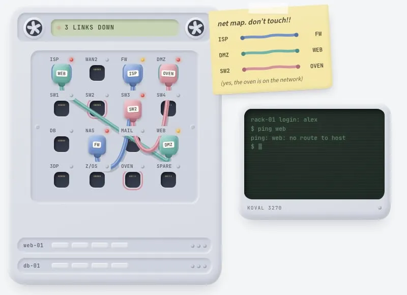
It lives on the contact page now. There’s no skip button and no plain email anywhere on this site. If you want to write to me, fix my rack. My site, my rules.
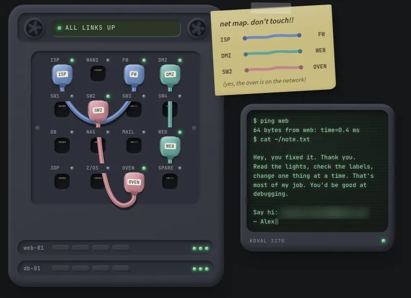
Not everything made the cut. We also built an interest graph and a pull-cord light switch, and both were fine. But you can’t have six features shouting at the same time, so I picked by loudness:
- One set piece that’s loud but lives on its own page: the rack.
- One ambient thing that’s quiet and changes over time: the sourdough jar.
- One one-shot delight: the owl printing once per visit.
- One hidden easter egg: the terminal. You’re welcome to find it.
Each one gets its own spot, so they don’t fight for your attention.
It works on boring stuff too: security emails
I have a small system that sends me daily security notifications for WordPress: new vulnerabilities, what’s exploited, what to update. This is what it used to look like:
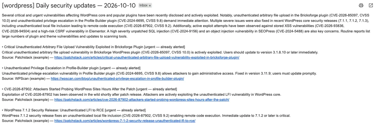
Technically correct. Completely unreadable at 8 in the morning.
I first asked Claude Design to make it nicer, and got this. It’s clean, it’s fine, it’s a dark header with coloured pills, and you have seen it a thousand times:
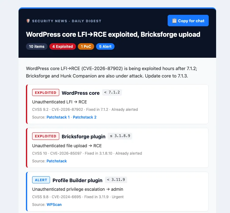
Then I ran the wow skill on it. Emails can’t run JavaScript, so there’s no rope physics here. The wow had to come from the art direction and from the same question: what does a security notice actually do? It tells you what to upgrade.
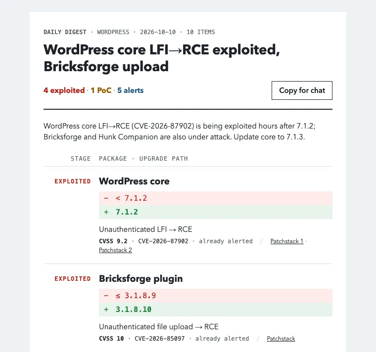
So one of the three versions shows every fix as a diff. Red line out, green line in. - < 7.1.2, + 7.1.2. You read it like a pull request, which is exactly what I’m about to do anyway.
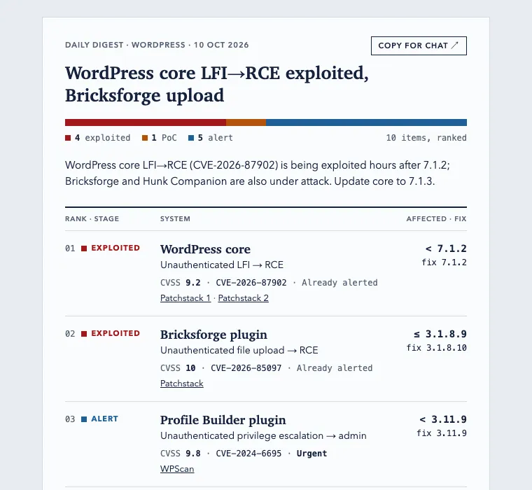
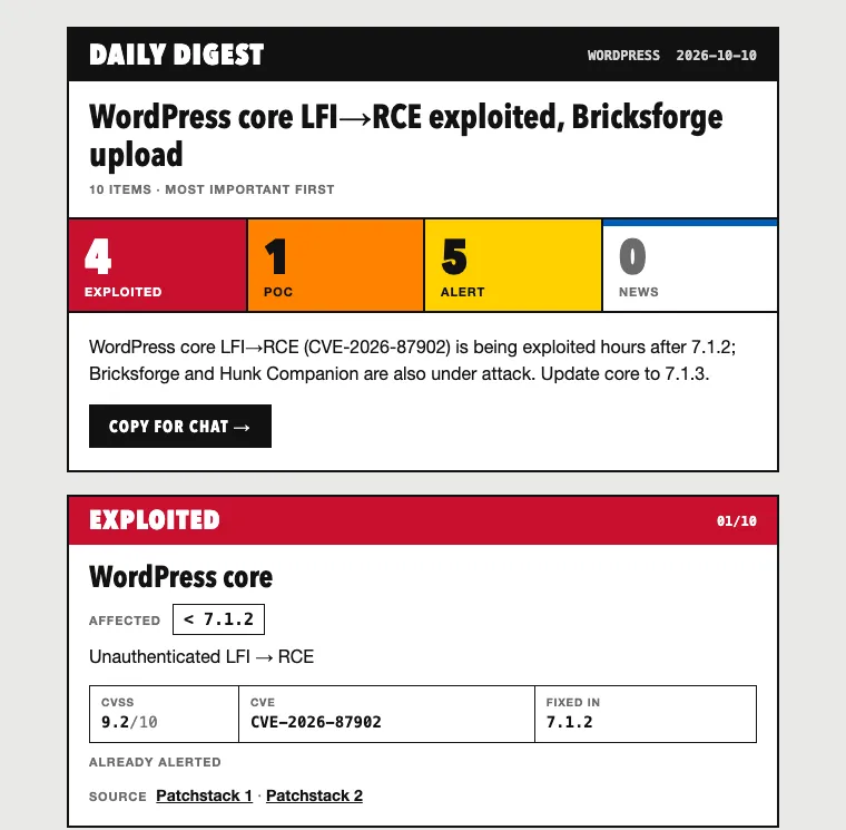
The other two went somewhere completely different. One is an editorial digest, ranked like a newspaper, with a severity bar at the top. The other is loud and brutalist, with big coloured blocks for exploited, PoC and alerts.
Same data in all five. The difference between “fine” and “I actually want to read this” was a direction and one good question.
The skill
After all this I asked Claude to turn the whole process into a skill, so I don’t have to explain it again every time. It’s called wow-page, and it goes like this:
- Look at the page or topic. What does the person or product do? What’s the stack?
- Find the verb. What does the subject do, what is it made of, what are its rhythms? This is the step that matters. The rest is logistics.
- Brainstorm ideas with you, each with a placement and a loudness. Plus an actual recommendation, not just a menu. Bring your own ideas too; the rack was mine.
- Write a brief and one prompt per agent: a different art direction for a redesign, or one feature each for an existing page.
- Clone the existing page once, so every agent starts from the same copy instead of its own guess.
- Run the agents in parallel, each in its own folder, each screenshotting its own work.
- Review everything with screenshots, honest downsides and a ranking. Somebody has to tell you which one is worse.
- Combine the picks into one prototype.
- Hand off to your real codebase with a spec, and a strict rule not to deploy anything. Shipping is still your job.
Download the wow-page skill (zip)
To install it for Claude Code, unzip it into your skills folder:
unzip wow-page-skill.zip -d ~/.claude/skills/Then ask for something like “improve my homepage” or “what wow thing can I add to my site”, or call it directly with /wow-page. It runs several agents at once, each for 10–30 minutes, so it’s not cheap. Start with three.
Conclusion
The wow isn’t an effect. It’s the thing your page is about, turned into something people can touch.
For a synth that’s playing it. For a sysadmin’s contact page it’s fixing a rack. For a security email it’s reading the upgrade like a diff. Find the verb first, give each agent a real direction, and let them check their own work.
And if you got this far, go fix my rack.
Comments
Comments live in GitHub Discussions (via giscus), so you need a GitHub account to join in.